Case Study
Shochu Omimai
Tradition meets type, on a cold summer beer.
Client
Internal
Do you like beer?
Damn straight, brutha! 🍺

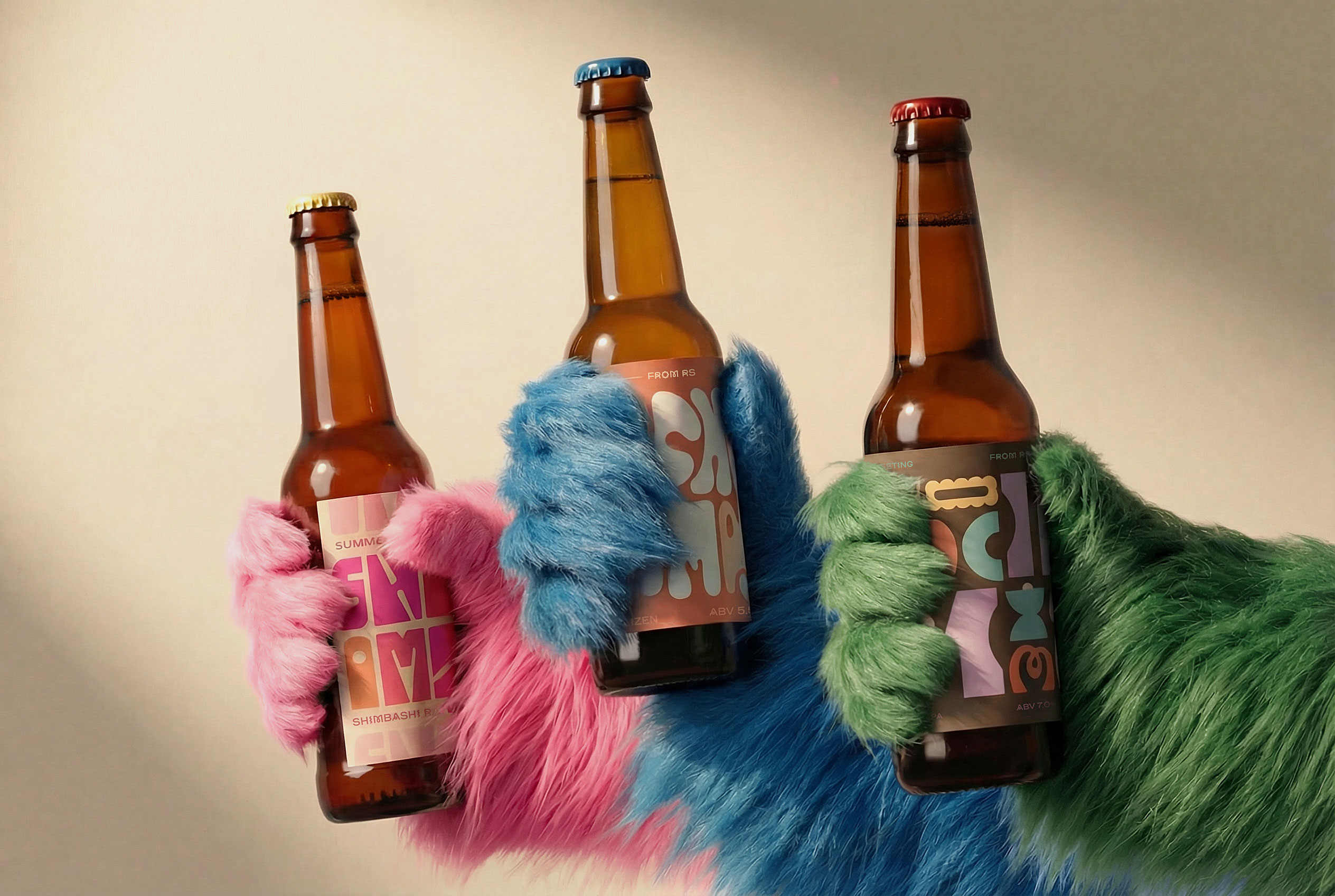
At RS, we turned a traditional summer greeting into a visual and sensory experience. Three craft beer labels, each driven by mood, flavor, and playful type. Because sometimes brand design start with a cold one.
Snapshot
Sometimes the best brand exercise is one with no client, no brief, and a hard deadline set by summer itself.
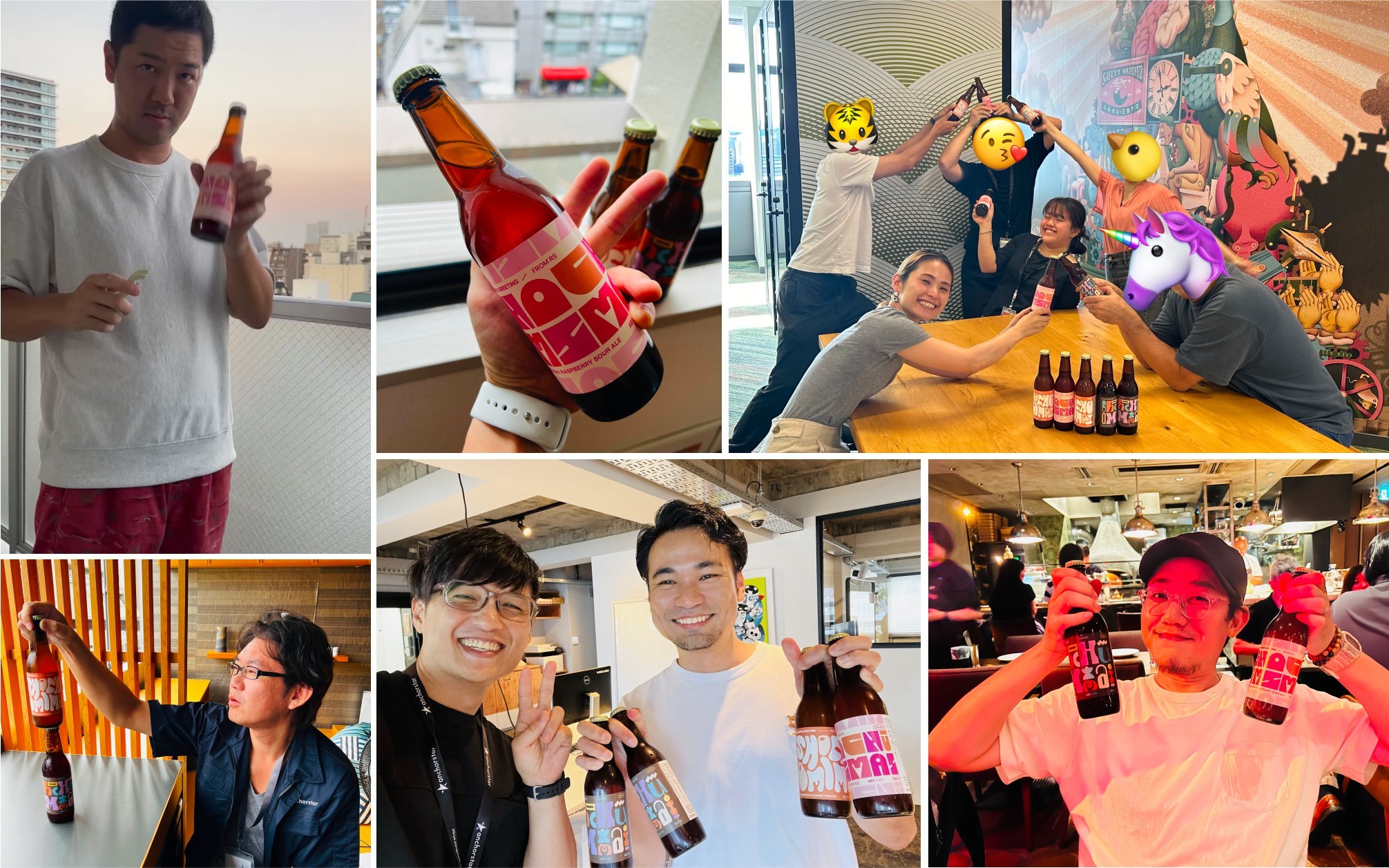
What it is: RS’s annual midsummer greeting, brewed · Format: three craft beer labels, each with its own mood, flavor profile, and typographic voice · Partner: Kunisawa Brewing Co. · Principle: tradition, evolved through design · Audience: clients and friends of the studio (and other beer-loving creatures).


Where there's brewsky, there's a brosky.

Brewsky, Le Chien
Beer Connosaire
The business situation
There wasn’t one — and that was the point. The shochū omimai is a midsummer greeting with centuries of history behind it, and most corporate versions of it are forgettable. We treated our own greeting the way we treat client work: as a small brand system that had to hold up under real-world conditions, in this case a sweating bottle in August.
Internal projects are where a studio shows what it actually believes. Every label went through the same design discipline we apply to client brands — because if we’re asking clients to care about craft at every touchpoint, our summer beer shouldn’t be the exception.
Let’s bring your vision to life
Alex Scott is your first conversation. Tell him the challenge your are facing in and he’ll help you figure out what it actually needs, whether that’s a project, a retainer, or simply a pointer in the right direction.

Alex Scott
Your first point of contact

Contact us
Case Study
Shochu Omimai
Tradition meets type, on a cold summer beer.
Client
Internal
Do you like beer?
Damn straight, brutha! 🍺
At RS, we turned a traditional summer greeting into a visual and sensory experience. Three craft beer labels, each driven by mood, flavor, and playful type. Because sometimes brand design start with a cold one.
Snapshot
Sometimes the best brand exercise is one with no client, no brief, and a hard deadline set by summer itself.
What it is: RS’s annual midsummer greeting, brewed · Format: three craft beer labels, each with its own mood, flavor profile, and typographic voice · Partner: Kunisawa Brewing Co. · Principle: tradition, evolved through design · Audience: clients and friends of the studio (and other beer-loving creatures).
Where there's brewsky, there's a brosky.
Brewsky, Le Chien
Beer Connosaire
The business situation
There wasn’t one — and that was the point. The shochū omimai is a midsummer greeting with centuries of history behind it, and most corporate versions of it are forgettable. We treated our own greeting the way we treat client work: as a small brand system that had to hold up under real-world conditions, in this case a sweating bottle in August.
Internal projects are where a studio shows what it actually believes. Every label went through the same design discipline we apply to client brands — because if we’re asking clients to care about craft at every touchpoint, our summer beer shouldn’t be the exception.
Let’s bring your vision to life
Alex Scott is your first conversation. Tell him the challenge your are facing in and he’ll help you figure out what it actually needs, whether that’s a project, a retainer, or simply a pointer in the right direction.
Alex Scott
Your first point of contact
Contact us